

case study
BEETHERE
More than a calendar.
Duration
The project was completed over the course of 11 weeks, during which all stages of the design process were carried out in accordance with the Design Thinking methodology.
Role
This was a conceptual project completed during a UX/UI design course. I took on multiple roles, including project initiator, requirements author, researcher, and both UX and UI designer. The work was carried out under the supervision of a mentor.
OVERVIEW
BeeThere is an application designed for freelancers in the wedding and beauty industry. It serves as a comprehensive calendar with features for creating a service catalog and maintaining a client database, tailored to the specific needs of this target group.
The goal was to design an application that streamlines the booking process, simplifies the management of files and documentation related to each order, and enables users to manage both business appointments and private events in one integrated calendar.
Limitations
As a solo, zero-budget project, it faced some limitations in ideation and testing, which encouraged a focus on low-cost, effective solutions.
There is a lack of applications specifically designed for freelancers in the wedding and beauty industries. Existing tools are primarily created for salons, making them overly complex and not tailored to the needs of independent professionals—especially regarding mobility and the integration of personal and business calendars.
Competition
How can it make money?
The product may generate revenue through a two-tier subscription model: basic and premium.
Potential recipients
The potential target audience includes freelancers such as makeup artists, hair, brow, lash, and nail stylists, photographers, videographers, and DJs.
BUSINESS CONTEXT
Users
Who are they and what do they do?
Freelancers such as makeup artists, hairdressers, photographers, and videographers who provide services both at their own studios and at clients’ locations.
What tools do they use in their daily work/life?
Facebook, Instagram, Booksy, GMB, OLX, phone, calendar (electronic or traditional), calculator, Google Maps.
What is their age and where do they live?
Aged 21 to 45, living in medium to large cities.
Project challenge
Design an application that enables service providers to quickly and easily manage their work through features tailored to their need - such as client record keeping, event scheduling, and storing and sharing specific information or files with clients.
Problem
Planning and organizing work both individually and during larger events - such as weddings or photo sessions - presents several challenges:
-
Consolidating appointments booked through multiple channels (Facebook, Instagram, Booksy, GMB, OLX, phone) into one place.
-
Managing the appointment calendar in the most automated way possible.
-
Preparing full-day schedules for assignments and easily sharing them with clients or other service providers.
Brief
The initial step involved creating a brief to define the target audience, outline their demographics, identify preliminary needs and challenges, and set the project goal.
PROJECT EXECUTION PROCESS

The interviews were conducted online with participants recruited from relevant Facebook groups.
I carried out three in-depth interviews based on a script containing 36 questions divided into 6 categories, plus an introduction.
Based on the interviews, I created two personas, presented in the following section.
03. In-Depth Interviews (IDIs)

I examined five applications — ranging from comprehensive salon and booking management tools (Booksy Biz, Caldis, Estetify), to more general-purpose tools such as Google Calendar and Todoist, the latter designed for task management by individuals or small teams.
02. Competition Analysis

I analyzed several available industry reports to familiarize myself with current trends, primarily in the beauty sector.
To better understand the characteristics of the target group, I also reviewed posts in Facebook groups where service providers share their ads, experiences, observations, and methods of organizing their work.
01. Desk Research
To achieve the goal, I applied the following methods:
The research was exploratory and aimed to understand how the target group works - their methods of organizing tasks, managing calendars, and the needs that arise from these practices.
EMPATHIZE
Conclusions from UX Research
01. Freelancers in the beauty and wedding industries need simple tools tailored to solo work
Most available applications are designed for managing salons or teams, making them overly complex for individuals running a sole proprietorship. As an alternative, freelancers often use general-purpose tools such as calendars or to-do lists, which do not address the specific needs of their profession.
02. Essential features are fragmented or missing in existing solutions
None of the current tools offer a complete set of features tailored to the target group’s workflow. There is no solution that combines:
- a calendar that clearly separates business and personal events,
- the ability to quickly record appointments, including travel time,
- file management linked to specific clients or appointments.
03. The application must support mobile-first work
Research revealed that users rely almost entirely on smartphones for managing their work. This insight led to the decision to design a mobile-first solution, focused on quick access and usability in the field.
02. Kornel
(represents people working in the photography/wedding industry)


01. Martyna
(represents people working in the beauty industry)


To synthesize the gathered user insights, I created two personas.
Personas, Empathy Maps, User Journey Maps
DEFINE
How Might We...
-
...streamline the process of managing bookings?
-
...help users easily and effectively manage both business and personal schedules?
-
...reduce issues caused by multiple booking sources and disorganized client files?
User Need Statement
Freelancers in the beauty and wedding industries, who acquire clients through various channels, need a solution that streamlines the booking process, offers intuitive calendar management for both business and personal events, and enables better handling of client information and related documentation. This will improve their efficiency, reduce the risk of errors, and increase client satisfaction.
Next, I defined the User Need Statement and How Might We questions to highlight the key challenges to address.
User Need Statement, How Might We

Lightning Demos
I began the ideation process with a quick review of three existing applications to explore available solutions and gather inspiration for the next design steps.
Brainstorming using AI
Since I conducted the project independently, I enriched the ideation process by leveraging artificial intelligence. This resulted in 33 ideas, 2 of which were generated by AI.
MoSCoW
After generating ideas, I grouped them into seven categories. Then, to identify the key functionalities for the project, I applied the MoSCoW prioritization method.


IDEATE
As a freelancer, I want to create and manage a client database, so that I can quickly access client information whenever I need it.
03.
As a freelancer offering multiple services, I want to create a Service Catalog, so that I don’t have to manually enter basic information about each service every time.
02.
As a freelancer, I want to quickly and intuitively record visits in my calendar, so that I can spend more time on important tasks, such as managing social media.
01.
User Stories
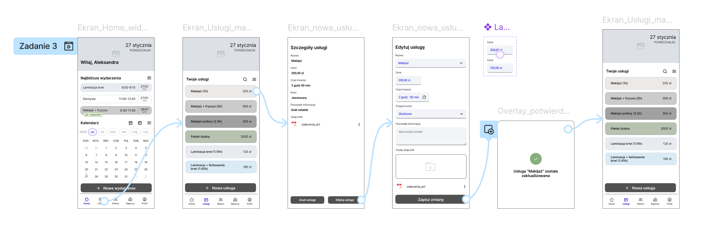
To better understand user needs, goals, and expected outcomes, I created three User Stories based on the prioritized product functionalities. They cover: creating a calendar entry, configuring a new service, and adding attachments to a customer profile.


Task Flows and User Flows
The functionalities described in the User Stories and identified as priorities were selected for the MVP.
To support this stage, I created task flow and user flow diagrams for the following features: creating a calendar entry, configuring a new service, and adding attachments to a client profile. These diagrams illustrate the steps and interactions users take while completing key tasks. Examples are shown below:
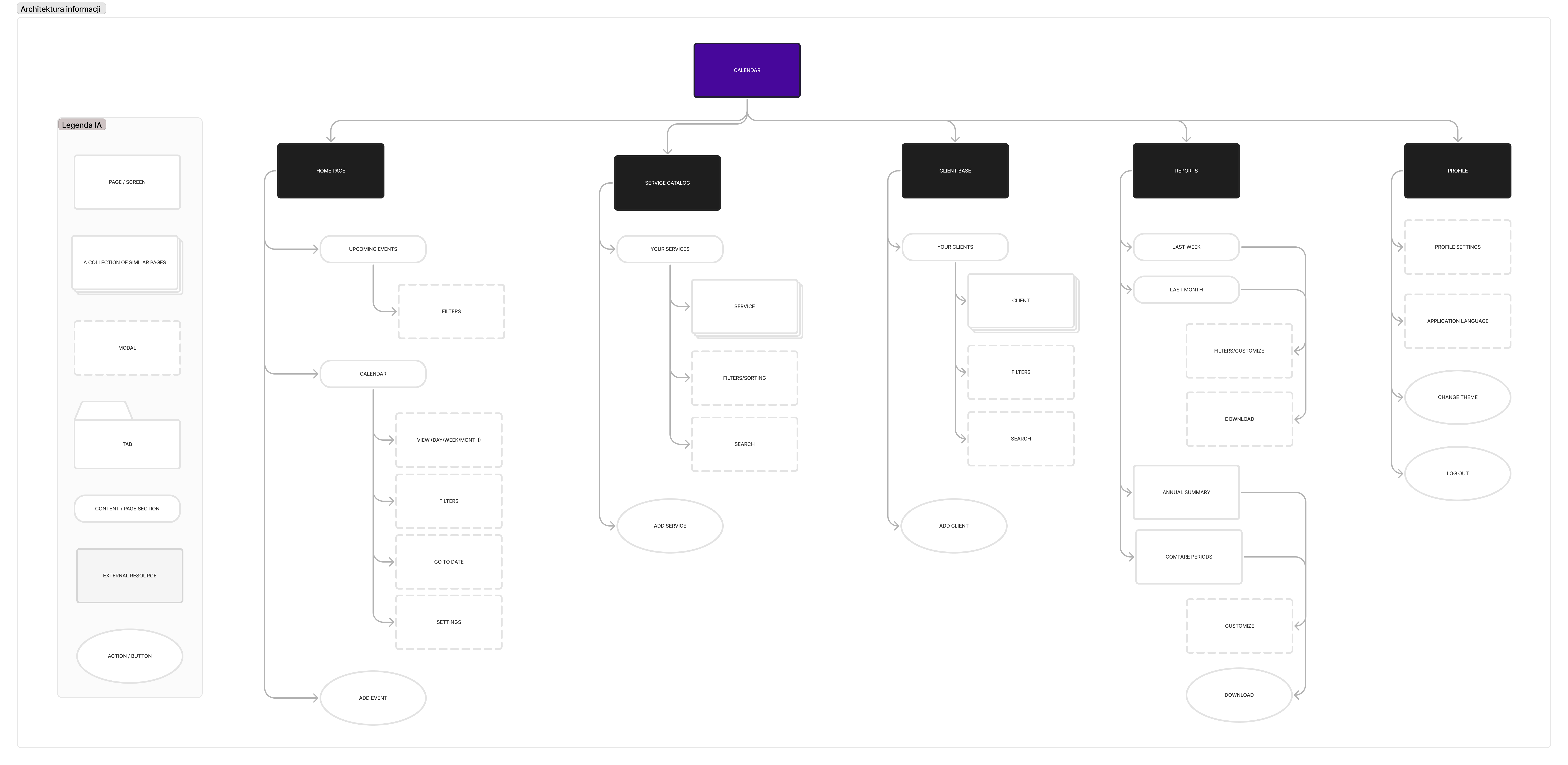
Information Architecture
Before starting the design phase, I created a preliminary version of the information architecture to define the hierarchy and relationships between key elements of the application.
This resulted in a sitemap, which served as the foundation for the next stages of the design process.
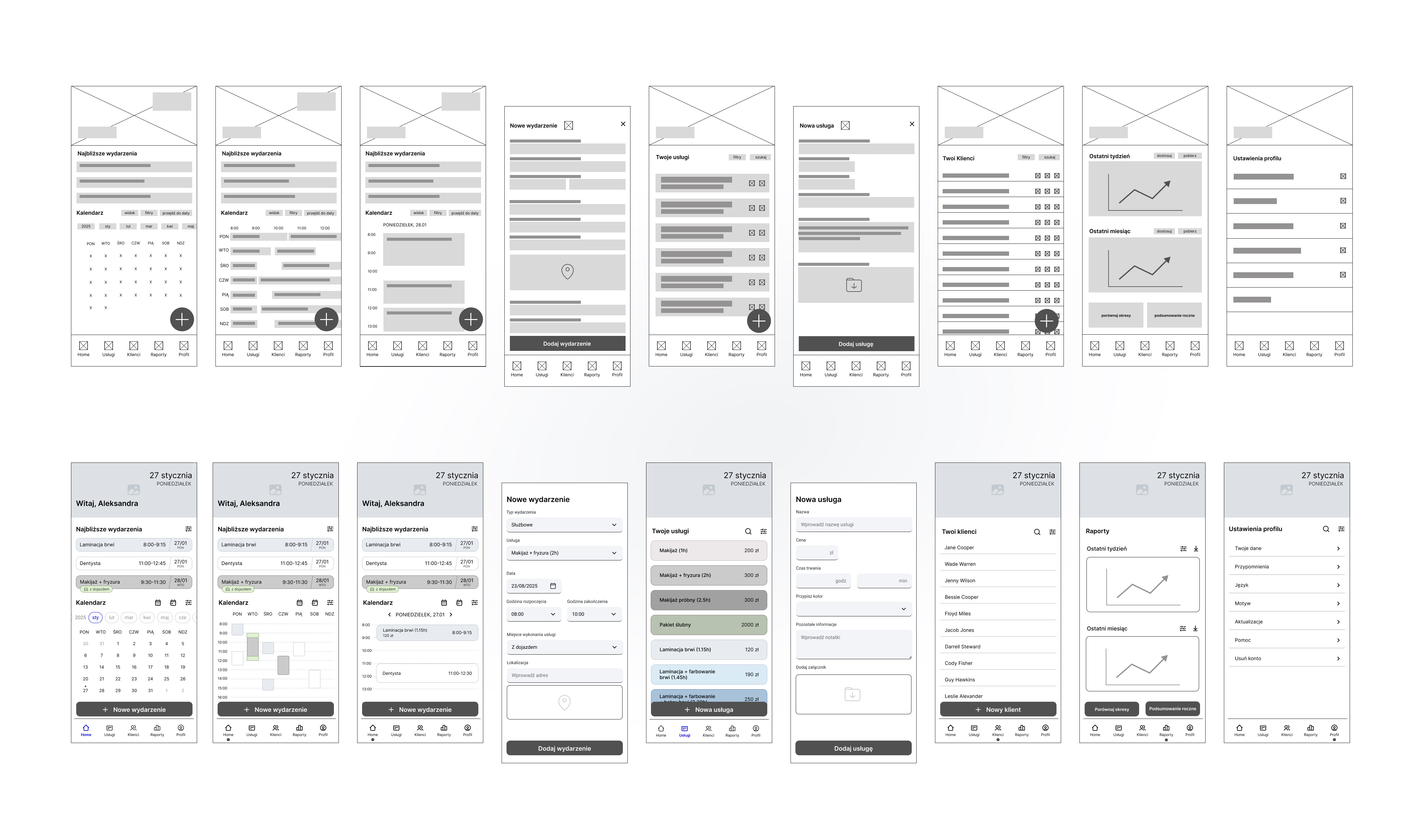
Low-Fidelity and Mid-Fidelity Wireframes
The design process began with low-fidelity sketches, initially created on paper and then transferred to Figma. I designed nine screens: the dashboard (in three calendar view variations), the service panel, clients, reports, and user profile, as well as screens for adding a new event and a new service.
In the next stage, the low-fidelity wireframes were developed into mid-fidelity versions.
PROTOTYPE
Modifications
While working on the mid-fidelity wireframes, I decided to introduce several modifications, including:

Removed rarely used “Edit” and “Delete” buttons from the service and client lists to reduce the risk of accidental clicks due to small button size and to improve list clarity.
04.

Removed the bottom navigation bar from the "Add New Event" and "Add New Service" screens by implementing modal screens instead.
03.

Changed the weekly calendar view from horizontal to vertical to improve usability and address issues with the limited size of event elements.
02.

Changed the round floating action button in the bottom-right corner to a horizontal version placed above the bottom navigation bar, to prevent it from obscuring elements in the calendar or service/client lists.
01.
Usability Test Scenario
I defined three research objectives:
-
Assess whether users can easily use the basic calendar functions (e.g., finding or adding an event).
-
Evaluate the usability of non-standard features such as the service catalog and client database.
-
Verify whether the proposed structure supports intuitive navigation and interaction with the application.
I prepared six tasks focused on key user interactions:
- Changing the way the calendar is displayed
- Checking an entry for a distant date
- Changing the price of a service
- Creating an entry in the calendar
- Adding a new service
- Adding an attachment to the client's account
The next step in the project was to develop a usability test scenario and corresponding task set.
Prototype Preparation
To conduct the usability test, I created an interactive mid-fidelity prototype in Figma that allowed users to complete the defined tasks.
Methodology
I conducted the usability tests as individual sessions lasting approximately 30 minutes each. The sessions were held in person to closely observe participants’ interactions with the application in a setting as natural as possible. With participants’ consent, the sessions were recorded.
Selection of Respondents
I recruited participants for the study from a Facebook group of professionals and enthusiasts in the beauty industry.
Usability Testing
In the next stage of the project, I prepared and conducted usability tests.
Accepted Criteria
People aged 21-45, working as freelancers in the makeup and wedding industry.
Test
The study involved two participants, aged 28 and 37, who work as freelancers in the beauty industry and use digital tools daily to organize their work, at least partially.
TEST
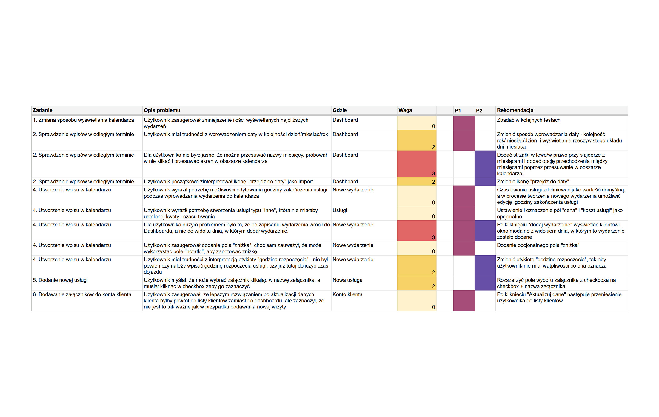
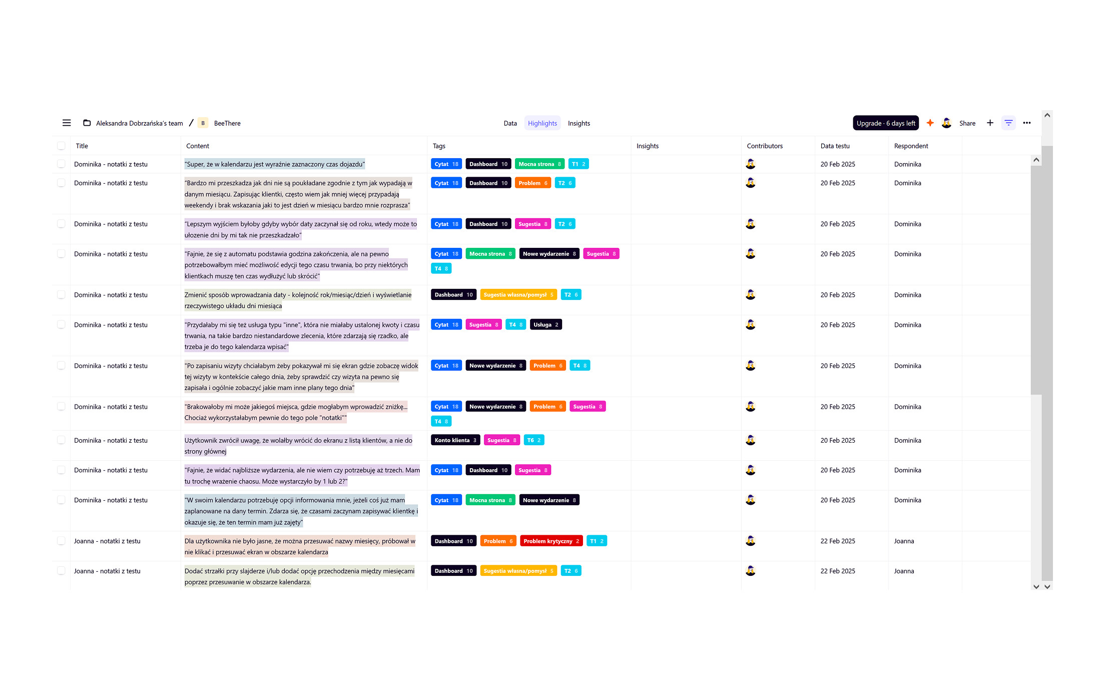
Data Analysis
I analyzed the data collected during the tests using Google Sheets and the Dovetail tool.
Solution: Replacing the "go to date" icon with a more intuitive one – a calendar with a magnifying glass.
Issue 4: Misinterpretation of the "go to date" icon in the main view.
Issue 2: Difficulty with checking the box when selecting attachments.
Solution: Extending the clickable area of the checkbox to include the attachment name.
Solution: Changing the date input format to year-month-day, allowing days to be displayed in their correct weekday positions.
Issue 6: Unintuitive method of entering and searching for a date.
Issue 1: Unintuitive way of navigating through months in the main view.
Solution: Adding arrows for navigating through months and enabling gesture-based navigation within the calendar area.
Solution: Redirecting the user to the relevant day view after saving the event.
Issue 3: Automatic return to the dashboard after adding a new event.
Solution: Changing the label from "start time" to "event start," improving clarity by indicating that travel time is not included at this point.
Issue 5: Difficulties in interpreting the "start time" label for business events that include travel.
Usability test results
Based on the analysis, I identified six issues grouped into three categories:
-
Navigation (issues 1, 2, and 3)
-
Interpretation of icons and labels (issues 4 and 5)
-
Date entry (issue 6)
Strong Points
During the research, respondents highlighted several functionalities they particularly appreciated in the application. These included:
-
clear indication of travel time in the weekly and daily views,
-
auto-completion features (e.g., event end time),
-
access to summaries of added events,
-
the ability to create client accounts, add attachments, and view visit history,
-
the ability to create a service catalog,
-
notifications about conflicts between events.
Further details about the research, analysis, as well as additional conclusions and recommendations, are included in the prepared report.
Basic Elements of the Product’s Visual Identity
BeeThere is an application designed for people leading busy professional lives who seek an effective tool to manage their work.
I chose yellow and black as the main colors, inspired by the coloring of bees — insects symbolizing hard work and good organization.
The name is a wordplay combining the sound of “bee” with “be,” as well as the phrase “be there,” referring to being present where freelancers provide their services.
The modern, minimalist logo features a simple calendar icon with subtle antennae, reinforcing the bee theme.
UI DESIGN
Style guide
Typography
Considering the app’s content-heavy screens, I selected the sans-serif font Figtree and applied a Major Third scale. This choice balances subtle size variations for clear hierarchy with readability, avoiding visual clutter and ensuring comfortable spacing.

Other Interface Elements
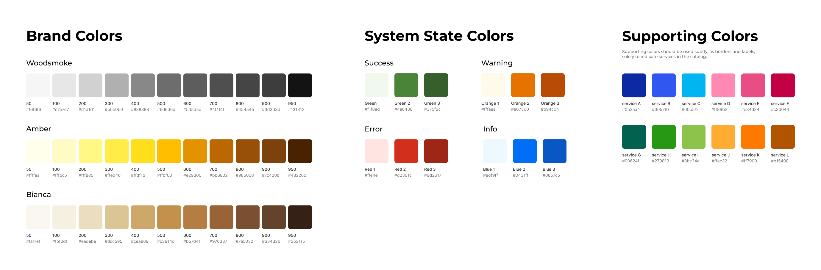
Colors
The primary colors chosen are yellow (Amber) and black (Woodsmoke), complemented by a beige shade (Bianca). The color scheme for system messages has also been defined, along with complementary colors designated exclusively for use as service indicators in the catalog.
Label "Mobile"
Business events conducted as mobile services are marked with a dedicated label.
User benefits: immediate information about the need to travel; in the week/day view, users can quickly see how much time is allocated for travel.
Customer database
The database stores all client information and related files in one place. Users can view past and upcoming visits on the client’s profile. The built-in "call," "SMS," and "email" functions enable quick contact without copying details.
User benefits: easy access to client information and attachments, as well as seamless communication.
Service Catalog
Users independently configure services in the catalog, each assigned a color (which can be shared by multiple services to create groups). Services include default duration, price, and attachments.
User benefits: faster event creation (selecting from a dropdown, auto-setting end time), customizable business events (e.g., travel, location), and quick access to client information.
Color Coding
Private events are consistently marked in gray, while business events are color-coded according to their specific service.
User benefits: clear visual distinction between personal and professional appointments.
High-fidelity prototypes
Given the text-heavy nature of the app, maintaining a minimalist design was a key project principle. Consistent backgrounds, thoughtful spacing, and removing unnecessary distractions helped ensure a clear and user-friendly interface.
The final outcome of the project was the creation of an MVP for the BeeThere application. As a conceptual project, the MVP was not published.
The project goal was successfully achieved by designing an application that addresses the specific needs of the target group. Key features include clear graphical differentiation in the calendar between private and work events, the ability to set and display travel time in the weekly/daily view and the "Upcoming Events" section, a service catalog with default price and duration settings, client account creation, and adding attachments to both client accounts and services.
RESULTS
The completion of this project allowed me to apply my UX/UI design knowledge in practice. I learned how to work following the Design Thinking approach, appreciate the importance of initial research and understanding user needs, and recognize the value of testing solutions to ensure they truly address those needs.
Given a sufficient budget, I would deepen the research by increasing the number of interview participants (from 3 to at least 8) and usability test participants (from 2 to at least 5). I believe this would provide a better understanding of users’ needs and pain points, enabling further improvements in the application’s usability.
With more time, I would also conduct a second round of usability testing to verify whether the changes made after the first test produced the desired outcomes.
Looking ahead, if the product were to be fully developed, I would aim to expand its functionalities to include schedule creation, service and revenue reports, reminders and widgets, and SMS automation for appointment confirmations.
CONCLUSIONS
ALEKSANDRA DOBRZAŃSKA
Phone:
+48 733 669 413
Email:
aleksandra.m.dobrzanska@gmail.com